First look: The story behind the new Matthew Knight Arena floor design
The I-5 Corridor caught up with the designers of Oregon's new basketball floor.
It’s Friday afternoon and Quinn Van Horne tells me to imagine I’m in a meadow — a Eugene meadow, specifically — surrounded by a perimeter of tall firs extending toward the heavens.
“As you’re looking into the sky,” Van Horne says, “the trees and the green slowly fade into the blue sky.”
We’re talking about basketball, by the way. Floors to be specific.
Van Horne is a senior designer with Van Horne Brands, and I’m on a Zoom with him and his dad, VHB chief creator Todd Van Horne. The pair were tasked with reimagining one of the most polarizing design choices at a school known for them. For the last 14 years, Oregon’s basketball court has been a lightning rod for takes, and on Sunday, the Van Horns will release their updated take on how the Ducks represent themselves on the actual hardwood.
No pressure, right? I mean, some people liked the court at Matthew Knight Arena. The floor was unabashedly Oregon and did accomplish one of the university’s main goals.
“We wanted to design the most iconic television presence possible for the University of Oregon by conjuring up a highly unique and visible basketball floor design,” said Tinker Hatfield, Nike's Vice President for Design and Special Projects, in 2010.
There was no questioning whose floor that was on TV. But it was also busy. And dark. And, especially when on broadcast, the oranges and browns making up the trees surrounding the floor muddied together.
“It got darker,” says Todd Van Horne, who designed the original Matthew Knight Arena logo that sat at center court. “In my view, being a little critical, some of the colors got too brown. The green got too dark and it was a little bit too contrasty on TV. So we wanted to be like, OK, let’s clean this up and make it a little bit more simple.”
And it is. As they show me the new floor I’m struck by two things:
1. It’s very green.
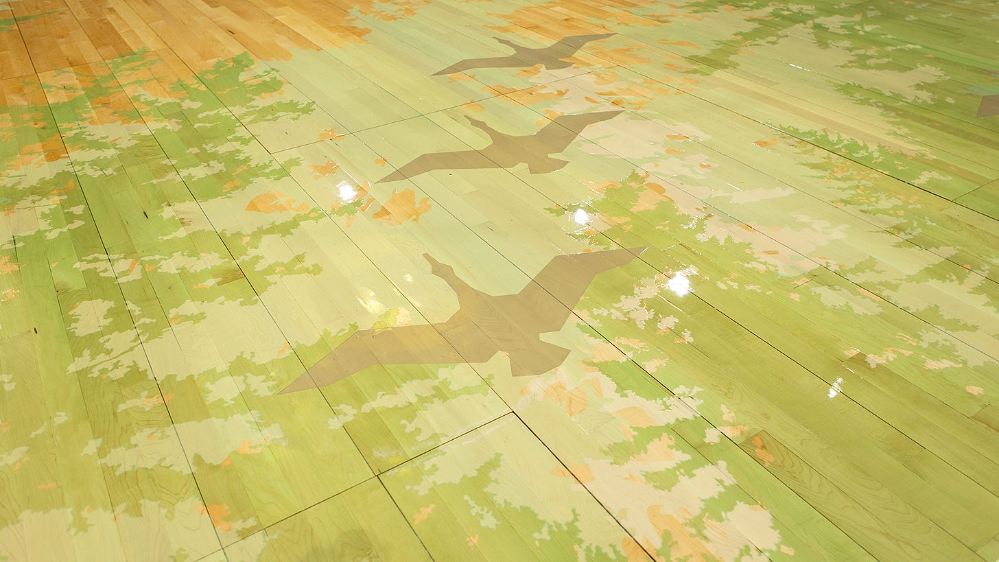
The browns are gone. The oranges are gone. That logo Todd Van Horne designed more than a decade ago has been repositioned and replaced at center court by a massive, green, O. The floor has a golden hue, with a grained look the Van Hornes say is an attempt to replicate the feel of the hardwood at McArthur Court.
2. It’s very similar.
The idea for this court doesn’t fall too far from the last one. The new Kilkenny Floor is still “Deep in the Woods,” with the perimeter of the court again surrounded by a forest of trees. They’re more recessed in this new iteration with a mixture of lighter colors. That doesn’t mean that Oregon didn’t go over the top in its production, though — the Van Hornes say that no two trees on the floor are alike.
“We went out and had a photographer take 250 — 270 — photographs of unique trees around the Northwest,” Todd says. “There’s no clipart. There are no vector files of those things. These are all completely unique.”
Todd says that was also part of Oregon’s goal heading into the Big Ten era. Starting this fall, the Ducks will begin participating in a conference with a bunch of teams from not around these parts. The Van Hornes say it was important to emphasize what makes Oregon, Oregon, and part of that means not shying away from taking another swing at a creative idea Todd says was inherently good the first time.
“There’s a million ways to execute a great concept,” Todd says. “It’s like, ‘Ok, we’ve done two versions of this now. What do we think landed? What do we want to keep moving and changing? And I think that’s what this next step is.”
This floor was a group effort, they say, one that came with numerous consultations with players and coaches about what worked and didn’t work. They’ve done TV tests. They stood over the court as the paint dried to make sure the green on the computer screen matched how it appeared on the floor. They found creative ways to include storytelling elements, such as the Flying V formations on the court missing a duck to honor Matthew Knight, the son of Phil Knight, who passed away in 2004.
“The conversation with Tinker was, ‘Let’s go back to the original concept that we started some 12, 13 years ago. The concept was honoring Matthew Knight,” Todd says. “And if Matthew Knight is looking down upon us from the heavens, and we’re in Eugene looking up at Matthew Knight, we’re basically in a meadow. And in that meadow, we’re looking up and you’re seeing the trees come around you. You’re seeing the light above you. That was the original concept. The feedback from the athletes was, gosh, we got to keep the trees. That’s such a signature element. We also heard from them that they wanted things lighter and brighter. And certainly from the coaching staff, they were like, let’s open up the floor a little more because the trees were maybe encroaching too much and it was just a little too dark. So let’s open it up.
“And from there, well, let’s start bringing in the greens.”
— Tyson Alger, The I-5 Corridor
More reading:


Big improvement.
Thank goodness for the update, I was never impressed with the Brown trees, thanks for putting Oregon Green back into Our Arena. Go Ducks